I am presently working on the structure and design of my website. I have added a small slideshow and a Google custom search function to the front page and created a much needed page with information about purchasing my photos (have also added that to this blog).
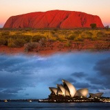 I am creating a new Australia section of my site with the best of my many Australia photos structured into smaller galleries like Sydney, Uluru etc. hopefully making it easier to find what you’re looking for – if not there’s a search button for ya! A lot of the old photos were holiday snapshots and have been deleted. The remaining old Australia photos from slides that I still want on the site will be re-uploaded in much better quality, having now been scanned on a slide scanner at 4800 dpi and 16-bit colour in the fantastic Vuescan software. It’s like breathing new life into my old slides and scanner, Vuescan is that good! Still to come in the Australia section: galleries with Best of Australia and Panoramas of Australia and a clickable map showing you the geographical location of my galleries AND lots of new images.
Everything is still very much work in progress, but have a look at the site and tell me what you think! Well, so far so good, the structure I can do but…as for the design of my logo and front page….I can shoot photos but am definitely not a designer! The front page and especially my logo and logotype is nowhere near how I want it to look. I have to hire a pro designer to do this, everything I design ends up looking like what it is – amateur hour! So a new front page is coming at some point but untill then let me know what you think!
3 Comments on “Website structure and design”
Aha, just saw that you need a designer. So it is official now. 🙂
As designer I must admit that your site is well-done; it's clean and focused on your great photography. Your images speak for themselves.
The front page suffers only from amateurish filmstrip in the header – I suggest using only one good image there instead, just like you did at"My Copenhagen" page.
Hi Logo Designer! Cool logos you've designed!
Thanks, glad you like the present layout. Nevertheless I have a new front page on the way. But you're right about the header and I can't wait anymore on new frontpage, I am so sick of staring at that super ugly film strip header – so I just followed your suggestion and did a super quick new logo and uploaded that right now!
Phew…filmstrip is gone forever! This logo I can live with for a bit.