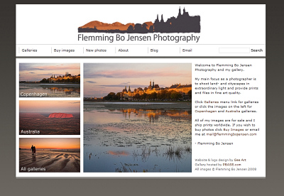
After two months of work I am now very happy to be able to present my new logo and new website design! All design work was done by the amazing Gudrun Eckleben of Gee Art in Sydney – the html and css was done by yours truly. Waste no time, click this thumbnail of the front page to visit my new gallery!
More information about the design
The aim of the design is to have a very clean and effective professional looking stylesheet where every single element on the page has been carefully styled. It’s all about my photos so the design and the colours are not overpowering but presents my photography in the best possible way. Hopefully it also gives you the impression of a professional company!
The front page is designed to fit completely on a 1024×768 screen (still the most used resolution although 1280×1024 is catching up). The centrepiece of the front page is my logo and a big slideshow.
To keep the front page clean the thumbnails for all galleries has been moved to a main gallery page – click Galleries in menu bar to access or use one of the 3 thumbnails on the left.
The layout is entirely CSS based – no tables, (except for the Pbase slideshow function which automatically adds a table) and along the way I learned a lot about CSS (and ended up hating IE even more!) and how to ‘hack’ the Pbase stylesheets to no end! I didn’t want to move away from Pbase.com because it is such a great community and it is also extremely good exposure (National Geographics have spotted and bought photos on Pbase so you never know!)
I recommend Firefox – using IE it just wasn’t possible to get the gallery pages looking 100% like I wanted it and how it looks in Firefox, Safari etc. – so use Firefox and get the true version!
The logo
My new logo is a very important part of the design and the identity of my business:
The font chosen is Kozuka and Japanese (I have a thing for Japanese simple-living design) and the idea of the logo graphic is to combine the two areas I focus on and love as a photographer:
- landscape (the domes of Kata Tjuta in the Australian red centre)
- cityscape (what else – Søtorvet in Copenagen)
Feedback
I am extremely happy with what we have achieved. Let me know what you think of the design and logo, I’m sure we’ll do some tweaks (actually there are still a few tweaks to be done) at some point and I’d love your opinion.
And a big thank you to Gudrun of Gee Art for all the super work!
P.S.
Can I just say how much I bloody hate the worst browser in the world otherwise known as Internet Explorer. So many bugs, such little regard for standards. Like any other web programmer I get my css looking just like I want it in Firefox (and Safari) and then discover that IE renders the whole bloody thing completely different because of box-model css bugs etc. so you have to code a truckload of css hacks just for IE…and of course IE6 have bugs different to IE7! I hate IE and wish everyone used Firefox!


2 Comments on “New logo and web design is now online!”
I liked the logo very much, good job, also the site design. I second you about the IE!
I agree. IE sucks. .. I do like your photography though…l. Props