 Lately I have been very much inspired by my friend Jes of Territorium Photography. He is a highly accomplished established photographer in Denmark and has a strong trademark style evident on his website, a very processed style. We have been discussing looks, styles and processing of images. How we are creatures of habits and often end up using the same style, because well, we do it well and know it, and subconsciously you keep thinking “just a bit more”. Meaning more contrast, more saturation, full throttle and it is really hard to attempt a “less is more” look. Something we are both looking for. A style that is less harsh and edgy.
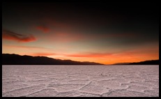
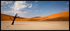
 I feel I have a somewhat strong style to my images and I like that style. Deep saturated warm reds and oranges, high contrast with an otherwordly light and look to a clean image. Evident in the two first images in this article. People have told me they recognise my images and style and I like that very much. Took years of work to get to that point. I would also very much like an alternative. Looking through my portfolio with Jes I realised that I seem to hit this look in almost every image. Without realising it I can do this look almost blindfolded. They all received volume 11 out of 10 in Photoshop using patented Escape in Landscapes magic touches (heh) in Lightroom and Photoshop. A look that I love and is my trademark. But I want an alternative look. I want another Escape in Landscapes style as well, one that is understated yet saturated, dusty, soft contrast, creamy and darkish. A style like a beautiful old slightly faded print yet still saturated and gorgeous in a way that does not jump at you but requires you to slowly take it in and appreciate the understated magic. I have to allow myself to develop images that look weird and boring etc. until I perfect an extra look in my arsenal. I must try and do as little as possible whenever my instinct tells me to do as much as processing as possible.
Badwater salt flats
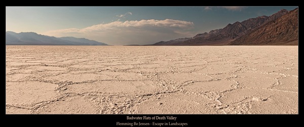
One of my favourite places in the US Southwest. Salt flats of Death Valley. Standing in the middle of the huge Badwater salt flat is a pure instant of Escaping into Landscapes for me. I recently stitched a panorama that I felt was a good candidate for testing a new look:
This style is still a work in progress. I am far from satisfied with this but it is a step on a new path. I have actually done a lot of processing on this panorama, but in a different way. Traditionally I would have added a lot more contrast, done a highly saturated very blue sky, very saturated mountains that would have received some high pass filtering for lots of texture. In this image, the sky is a completely new blue hue. Dusty, creamy yet still saturated. Contrast is soft. Mountains have been softened, and hue is changed to a dusty brown. I would normally texture the cloud to the pixels bleed bloody abuse but here I just add a slight texture, keeping it soft. A very understated look. It is a light image, so the ‘darkish’ look does not apply here though, I will have to try that on another image. It is also not really an ‘internet’ look, more of a ‘print’ look.
“A style like a beautiful old slightly faded print yet still saturated and gorgeous in a way that does not jump at you but requires you to slowly take it in and appreciate the understated magic” – It is still escapism but into Another New World. Let me know what you think, feedback much needed.

17 Comments on “Another New World”
The photo from Namibia is stunning, with a very clean composition.
Is it Xpan?
Thank you very much! It is a Canon 5D Mk II image, cropped to a wider composition.
Hi Flemming, It's probably pretty close to actual reality but I think that sky detracts from the foreground. Seems like the sky and hills probably could do with some more on the Clarity slider. It's harsh light anyway.
Hi Tim, thanks for the feedback, helps a lot. Clarity slider adds contrast and texture, you would like more of this on the hills and sky?
I understand where you are trying to go, I don't think this is the type of image for it.
At the moment there seems to be a disconnect between foreground and background. As I said, the light is harsh and contrasty anyway, so faded and low contrast doesn't seem to suit it, to my eye anyway.
Hope that makes sense!
Thanks Tim, I see what you mean now. I think the test was to make a harsh image low contrast, faded and dusty looking but whether it works is another matter. Thanks for your feedback, always appreciated!
No worries Flemming,just my humble opinion! Good luck with the experiment.
Hi Flemming, i applaud your desire to strike off in a new direction, not because i don't like your old direction (cause i do!), but i think its good to keep exploring and trying new things. On the last image on the page i think i agree with Tim, it feels unfinished. perhaps its not a case of not doing so much as doing something different.
Have you had a look at the Joseph Holmes editing colour spaces? http://www.josephholmes.com/profiles.html They give some fantastic headroom for editing colours, and if you use the chroma variants of the various profiles, you can control saturation very precisely without affecting the luminance of your image… sorry this is a bit long winded… you can then layer your image with different versions, with different chroma variance saturations, and mask in bits and pieces to add emphasis. Could be an interesting place to go for a new direction, assuming you haven't gone there already of course. The great thing about this method, is the level of control and the non destructive nature of it.
Hi Adam, thanks very much for the feedback. It definitely is unfinished! It is just a test. Cheers for the link, finally I know what the hell those DCam profiles are that I have seen people use 🙂 Will definitely check it out.
i think its a cool look! One i have wanted to know how to achieve for a long time so let me know whenyou get it! 😛
As for your normal look like of horseshoe bend I would love to know your usually techniques….. I know the feeling of getting stuck in PS and i dont like it!
Thanks Dylan! You can buy my magical Escape in Landscapes tutorials soon mate ehhehe. I may do a post one day on the basis of how I achieve my style, like the Horseshoe Bend image.
Cool new look indeed, but i sense like sth is missing in it for now – i can identify it yet but would love to see some images when You're done perfecting this new Flemming style 😉
Thanks! Indeed it is not finished at all so there's a certain magic missing. Will be a while before I nail it I think but I will keep pursuing a new style. Not that I am abandoning the old style, I just like to have options so every image do not have the same look.
Yup I rate the top 2 little buddy!
Well done son!
Hehe, cheers mate, very grateful, but the top two are already released images using the old classical Escape in Landscapes style of mine. The bottom one Saltwater Flats is the work-in-progress in creating an alternative style 🙂
Yep I don't mind the bottom one either Bomont and I see where you are going with it!
thanks Mark !